

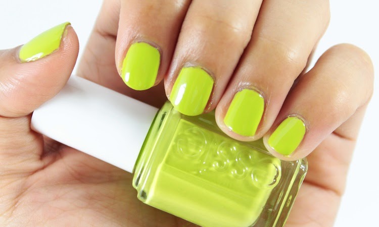
In terms of application, the creamy formula, while a little goopy, was opaque and even in three thin coats. It also has a fairly glossy finish without a top coat.
While I'm glad I picked it up, I'm not sure how much use I will get out of it. Perhaps it's better suited as an accent colour to a deep pink polish?
Would you wear this colour? Or does it seem a little more Halloween-ish than summer-ish? x
While I'm glad I picked it up, I'm not sure how much use I will get out of it. Perhaps it's better suited as an accent colour to a deep pink polish?
Would you wear this colour? Or does it seem a little more Halloween-ish than summer-ish? x
Pricing & Availability
$10.99, Shoppers Drugmart
Essie "The More the Merrier," three thin coats, no top coat


I find that this is an amazing color for the summer because it would look great with a tan!! But you are right I dont know if it would work with me!!
ReplyDeletexx
http://the-astyle.blogspot.ca
I normally hate these types of chartreuse shades, but I have to admit that it looks really great on you! :)
ReplyDeleteI actually really, really LOVE this on you - I think it complements your skin tone so well! I don't think I could pull this colour off as well as you. Gorgeous pictures! :)
ReplyDeleteit's one of those "pretty-ugly" shades. personally not for me. On a sidenote this looks EXACTLY like CoverGirl's Appletini from the Glosstinis collection!
ReplyDelete